Website design tips for small business owners who want more calls
Website design tips for small business sites: speed targets from Google's Core Web Vitals, how people actually read web pages and the mobile basics that matter.
A small business website has one main job: turn a visitor into a call, a booking or a sale. Beautiful design helps only when it serves that job. These website design tips for small business owners focus on what research and Google's own documentation say actually matters, so you can spend your budget where it counts.
1. Design for the phone first
Google's documentation on mobile-first indexing says Google uses the mobile version of a site's content, crawled with its smartphone agent, for indexing and ranking. So the version of your site that Google judges is the mobile one.
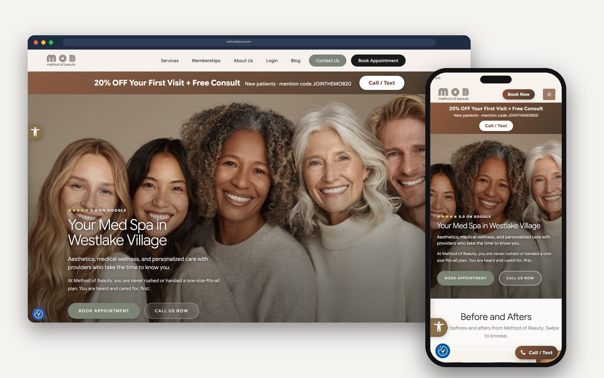
That makes mobile-first design a practical requirement, not a trend. Check your site on your own phone:
- Can someone find your phone number and tap to call within a few seconds?
- Do buttons have enough room to tap without hitting the wrong one?
- Does the most important information show up without endless scrolling?
- Is the text large enough to read without zooming?
2. Meet Google's speed and stability targets
Google's Core Web Vitals measure three parts of how a page feels to a visitor. For a good experience, web.dev says:
- Largest Contentful Paint (LCP) should occur within 2.5 seconds of when the page starts loading.
- Interaction to Next Paint (INP) should be 200 milliseconds or less.
- Cumulative Layout Shift (CLS) should be 0.1 or less.
You do not need to measure these by hand. web.dev lists tools that report them, including PageSpeed Insights and the Core Web Vitals report in Search Console.
web.dev recommends measuring at the 75th percentile of page loads, split across mobile and desktop, so the targets cover most of your visitors, including the ones on slower phones.
In small business website design terms, that usually means compressing large images, limiting heavy scripts and plugins, reserving space for images and ads so the page does not jump around while it loads and choosing a host that responds quickly.
3. Put the important things where eyes go
The Nielsen Norman Group's research on the F-shaped reading pattern found that people often scan web pages instead of reading them, with fixations concentrated at the top and the left side of the page. Users typically read across the upper part of the content first, then move down and read a shorter horizontal stretch, then scan down the left side.
The lesson is simple: design for scanners.
- Put your main message and your call to action near the top.
- Start headings and paragraphs with the words that carry the meaning.
- Break long text into short sections with clear headings.
- Use bullet lists for services, features and steps.
4. Make the next step obvious
Every page should answer one question for the visitor: what should I do now? Choose one primary action per page, such as calling, booking or requesting a quote, and make it the most visible button. Secondary options can exist, but they should not compete with the main one.
Forms deserve special care. Ask only for what you need to follow up, usually a name, a way to reach the person and a short note about what they need. Every extra field is one more reason to leave, and a form that asks for a budget or a company size before saying hello can feel like a test. Tell people what happens after they submit, such as when you will reply.
5. Show proof close to the ask
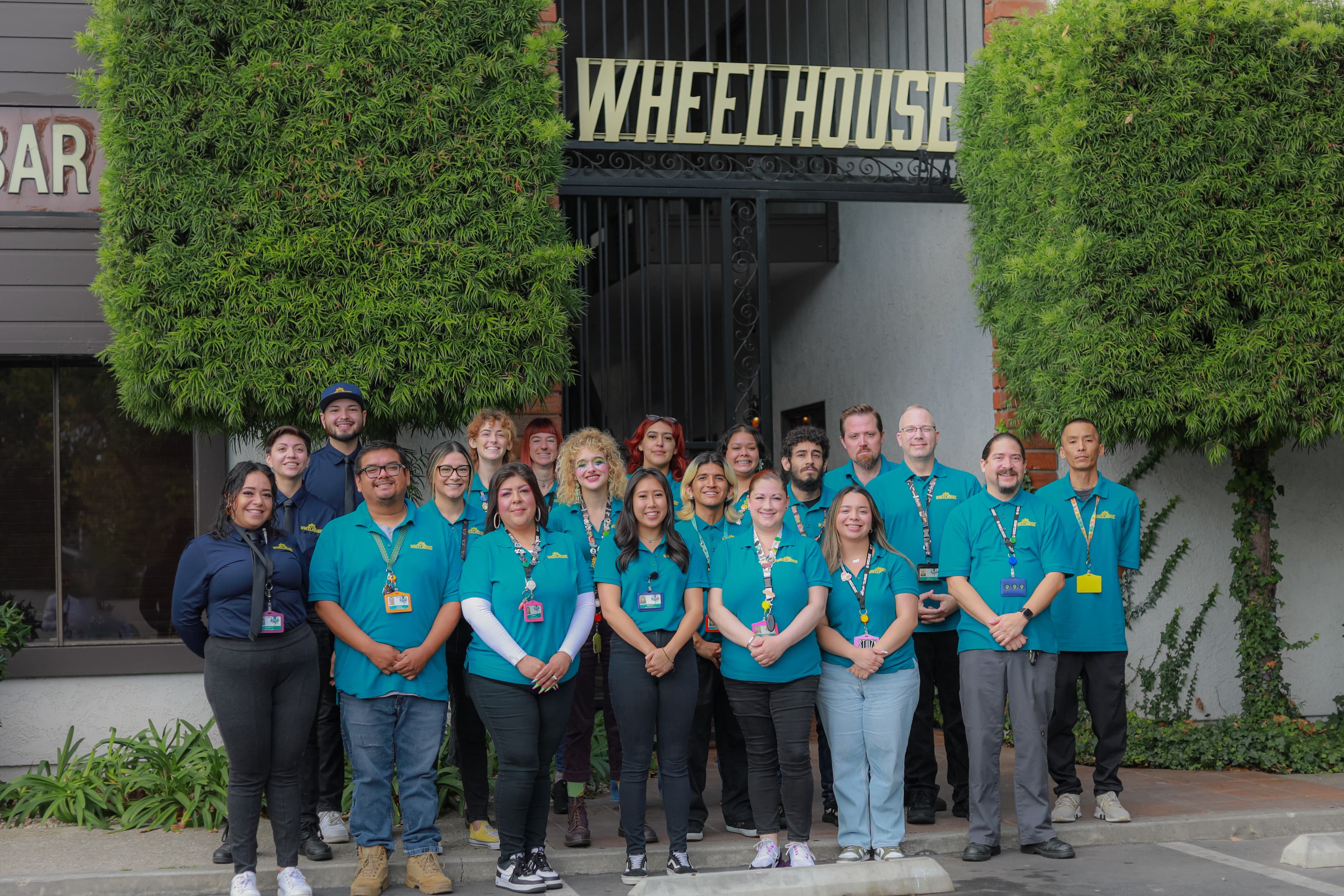
Visitors want to know whether you can be trusted before they contact you. Place reviews, recognizable client names you have permission to use, certifications and photos of your real team near the buttons that ask for action. Our post on what makes a landing page convert goes deeper on this.
6. Write like you talk to customers
Use the words your customers use. If people search for "AC repair," do not call it "climate system restoration." Clear, specific copy helps visitors and search engines understand what you do. Our guide to SEO-friendly web design covers how design and search work together.
7. Test it with real people
The quickest way to find problems is to watch someone use your site. Ask two or three customers or friends to find your phone number, book an appointment or learn what a service costs, on their own phone, while you watch without helping. Every place they hesitate is a place to fix. It takes an afternoon and costs nothing.
8. Keep it updated
A website is never finished. Review it every quarter. Update hours, services, staff and photos, fix broken links and check your Core Web Vitals in Google Search Console. A current site tells visitors you are still in business and paying attention.
A quick checklist
- Phone number tappable at the top of every page on mobile.
- LCP within 2.5 seconds, INP at 200 milliseconds or less, CLS at 0.1 or less.
- One clear call to action per page.
- Reviews and proof near every button.
- Headings that make sense to someone who only scans.
If you are weighing a rebuild, our guide to web design services explains what to expect and what to ask for.
Sources
Checked October 3, 2026. Platforms change their guidance. The linked pages are the final word.